Quidget · 2024
Building the public face of an AI product — where visitors arrive with doubt and need to leave with confidence that the product works and is worth trying.
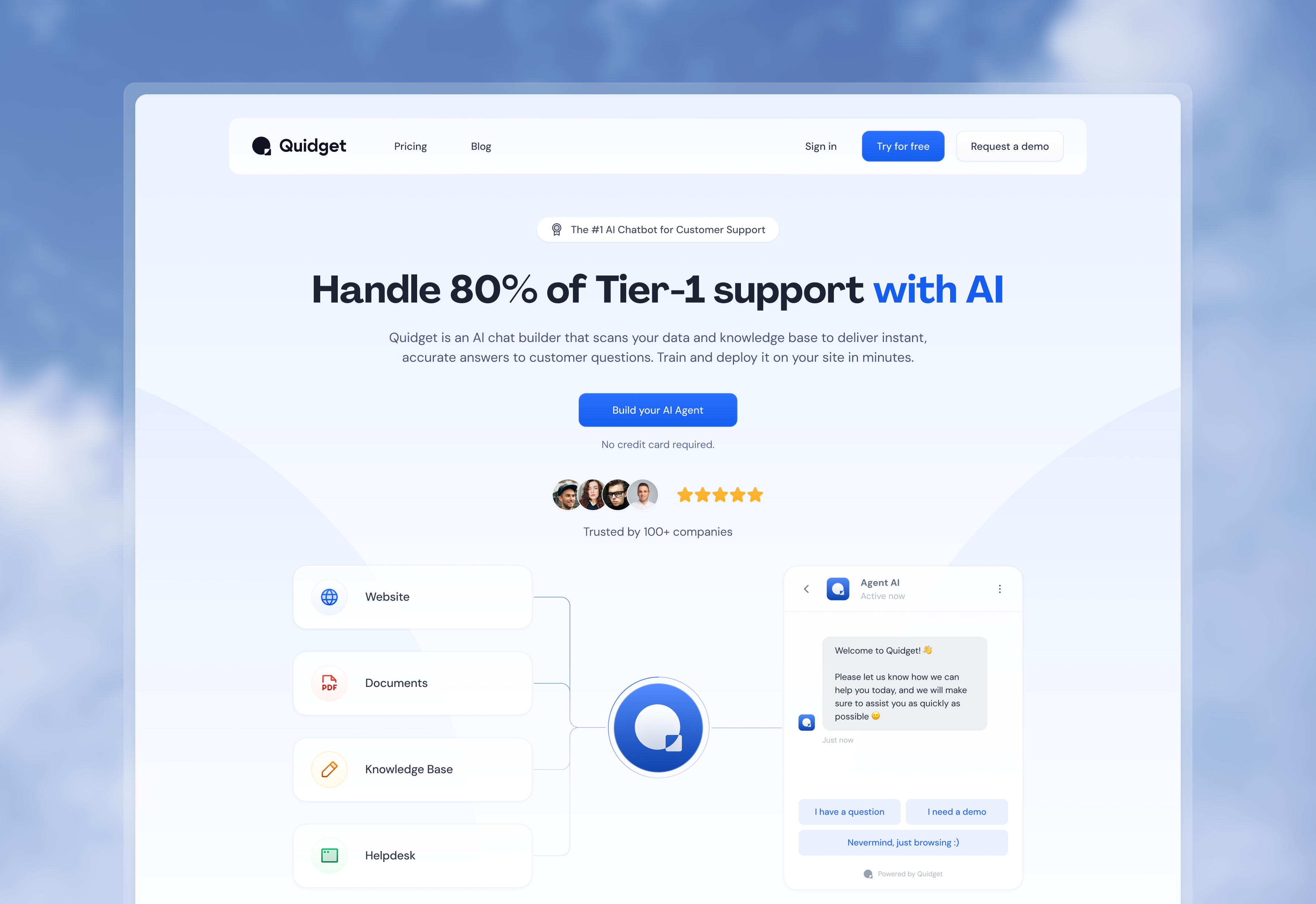
AI products have a credibility problem. Everyone claims their AI is smart, fast, and easy to use. Visitors are skeptical by default — they've seen the promises before. The marketing website had to cut through that noise with something concrete: proof.
Quidget's real differentiator was the onboarding experience itself. The product could build a fully working, branded AI agent in under two minutes. That needed to be the message — not just stated, but demonstrated.
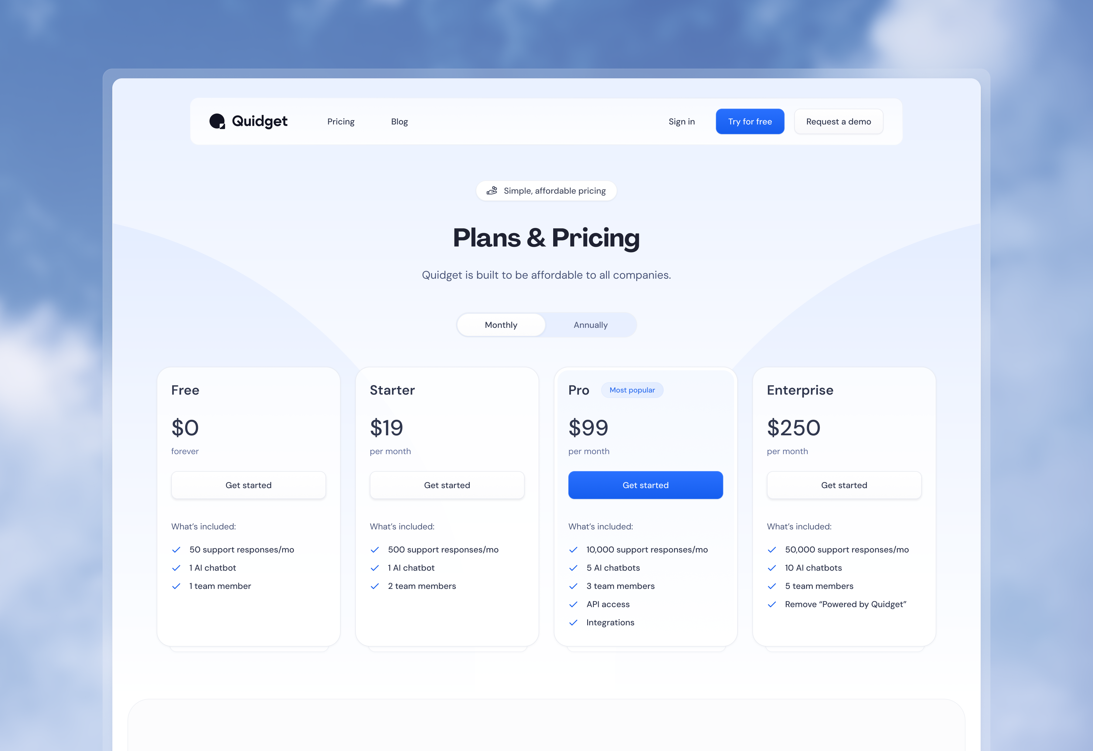
Pricing page — clear tiers, no hidden friction, conversion-focused layout.
The hero section led with the aha moment, not the feature list. Instead of "build an AI chatbot," the message became: enter your URL, watch it build itself. Concrete, specific, and different from what competitors were saying.
Every section was designed to reduce one objection at a time. How does it work? What does it look like on my site? What does it cost? The visual hierarchy guided visitors through doubt → curiosity → confidence → trial.
I designed the full site — landing page, pricing, feature pages — maintaining visual consistency with the product itself. The website and the app spoke the same design language.
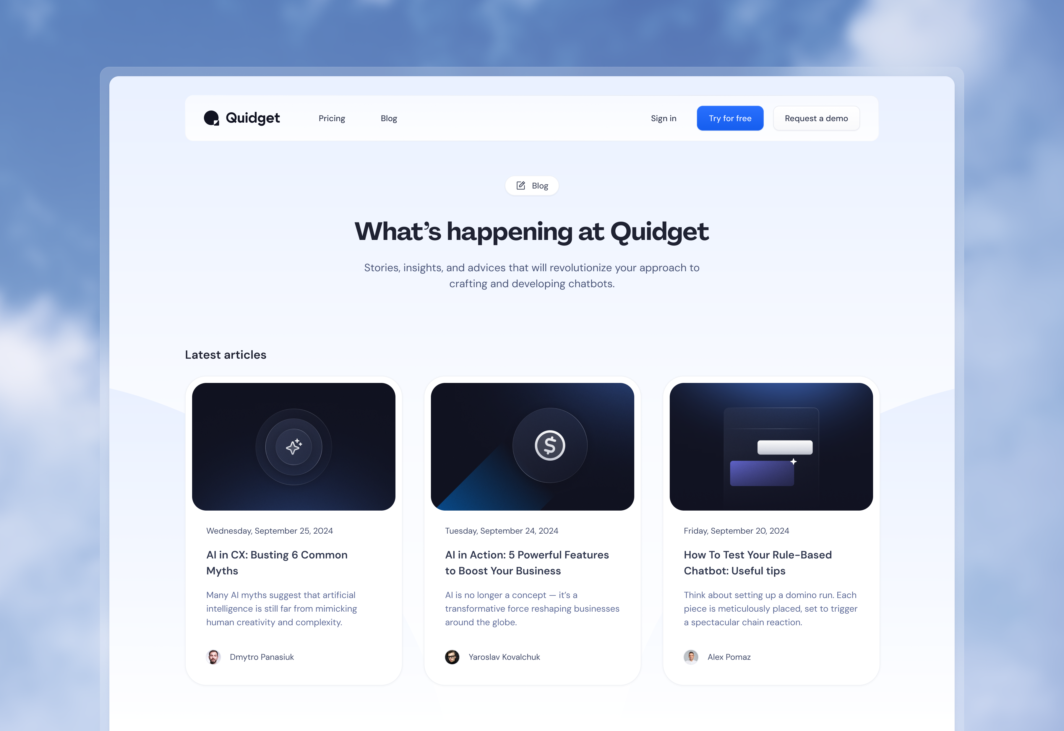
Blog — content marketing built into the site, same design language throughout.
The website became the first impression for thousands of potential customers. A strong marketing site doesn't just describe the product — it previews the quality of the product itself. Visitors who saw a polished, credible website were primed to trust the product they were about to try.
The design system built for the website fed directly into the product UI — shared components, shared visual language, shared standards. One source of truth for what Quidget looked like to the world.
Work created for SupportYourApp, Inc. All rights reserved by SupportYourApp, Inc. Shared here for portfolio purposes.