Remoter.me · 2023
Designing the public face of a remote work platform — a single page that needed to communicate the product's core value to distributed teams and get them to sign up.
Remote work tools are a crowded category. Remoter.me needed to stand out on first impression — before visitors had time to compare features, pricing, or alternatives. The landing page had to earn attention and quickly answer the question every visitor arrives with: "is this for me?"
The audience — managers of distributed teams — is time-poor and skeptical of new tools. They've been burned by onboarding costs before. The page needed to feel like it was built by people who understood remote work, not by people who thought they understood it.
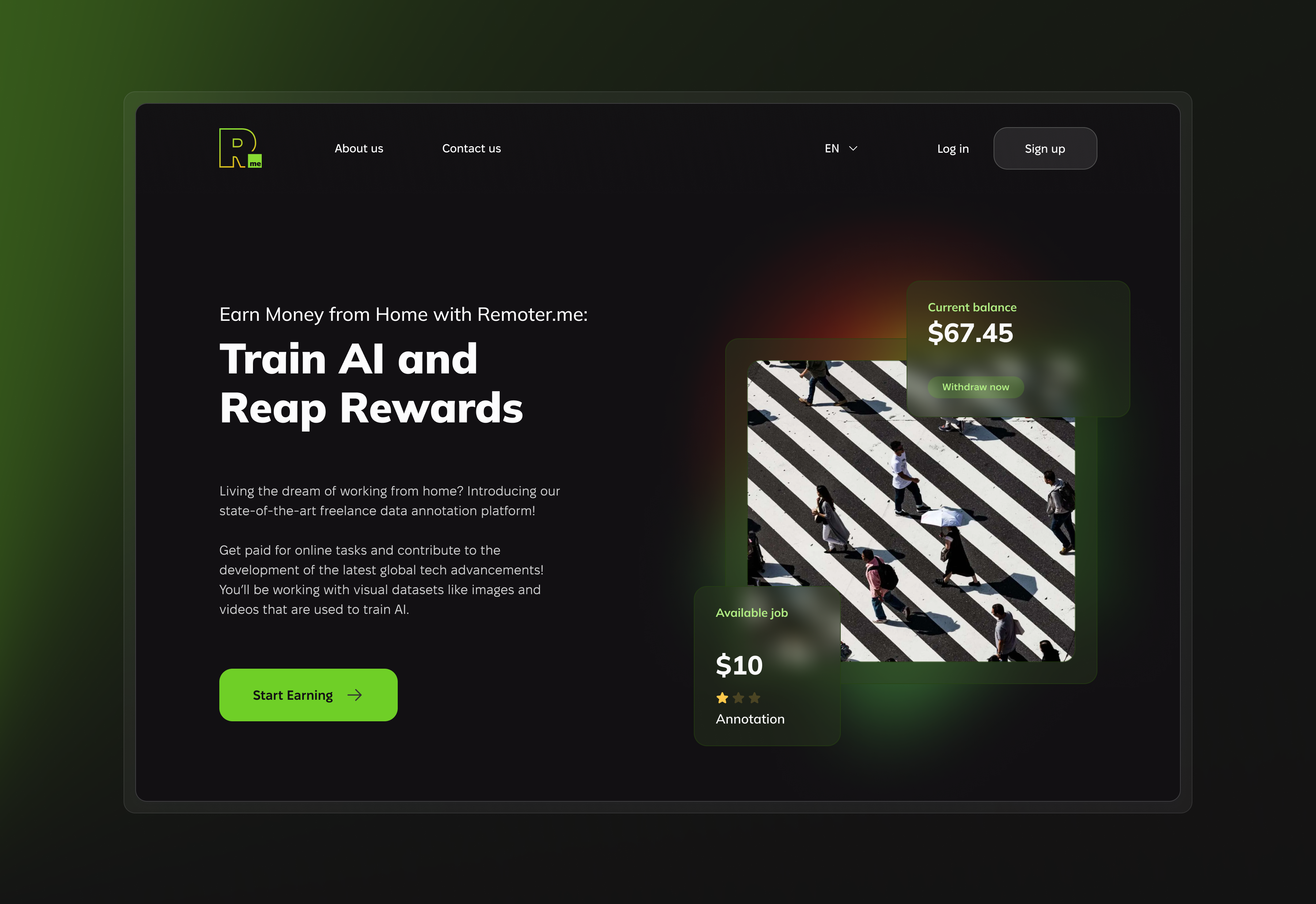
The visual direction went dark — a deliberate contrast to the lightweight pastels dominating productivity tools at the time. Dark backgrounds communicate seriousness and focus. They also made the product screenshots feel cinematic rather than corporate.
The information architecture followed a single thread: what it is → why it matters → how it works → who else uses it → try it now. No side branches, no distractions. Every scroll answered one question and created the next.
Copy focused on outcomes, not features. Remote teams stay in sync over "we offer async communication tools." The difference between language that explains and language that sells is whether you're talking about yourself or talking about the person reading it.
A landing page that communicated what the product was before explaining how it worked. The dark aesthetic helped — it signalled something more considered than the usual productivity tool.
Work created for SupportYourApp, Inc. All rights reserved by SupportYourApp, Inc. Shared here for portfolio purposes.