Quidget · 2023–2025
Designing the complete Quidget product — dashboard, AI configuration, testing, and channel management — as a single coherent system that makes running an AI agent feel effortless.
When you're building a B2B SaaS product from scratch, there's no existing UI to iterate on. No legacy patterns to work around. No inherited navigation structure. Every screen, every interaction, every component needs to be designed — and they all need to feel like they belong to the same product.
The challenge is that a product's complexity directly reflects its capability. A powerful AI chatbot platform needs to let users configure model behavior, manage knowledge sources, customize branding, test responses, and deploy to multiple channels. Making this feel effortless without hiding capability is the core design problem.
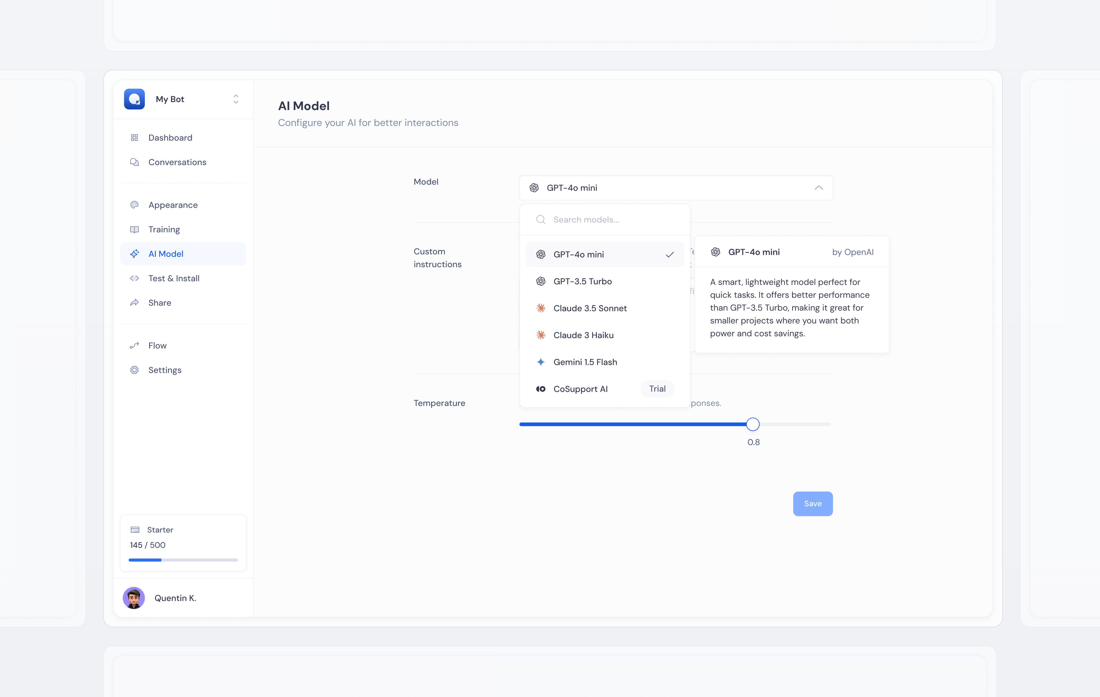
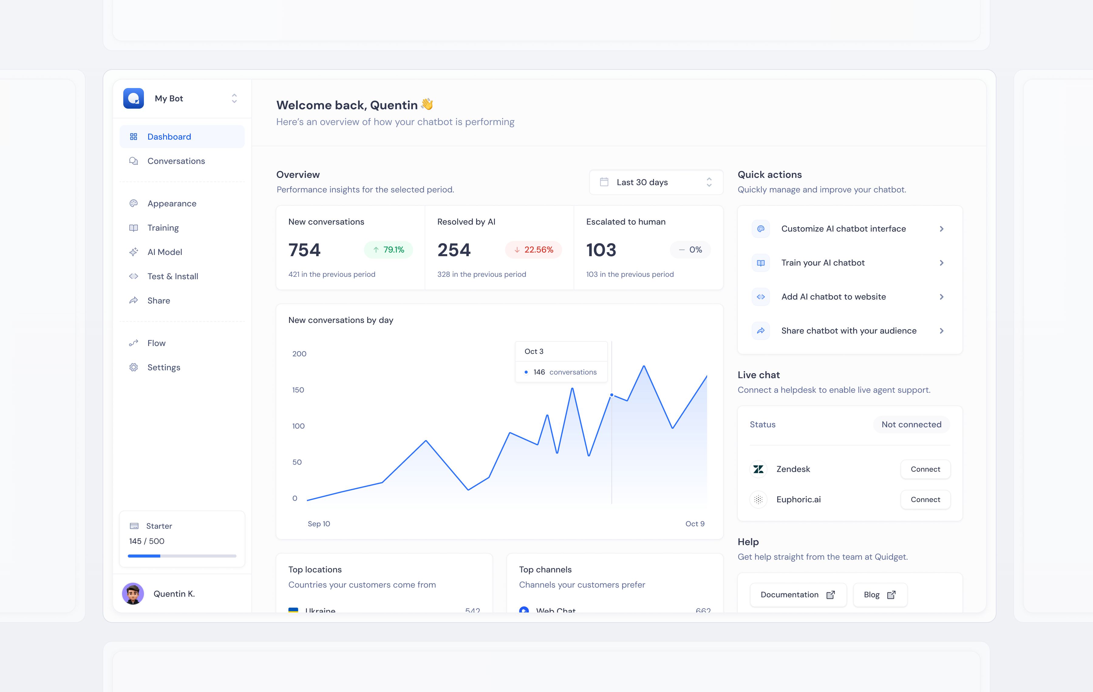
AI Model — selecting knowledge sources, training data, and conversation behavior in one unified view.
I designed the product as a single coherent system — not screen by screen, but as a design language applied consistently across every surface. Components were designed before screens. A shared library of inputs, cards, toggles, status indicators, and data displays was established first, then assembled into interfaces.
The navigation structure followed the user's mental model: set up your AI → train it → customize it → test it → deploy it. Each section of the product mapped directly to a step in that journey. Users arriving at any screen for the first time could orient themselves immediately — because the structure was intuitive, not inherited from engineering architecture.
This also meant that as new features were added across two years of development, they felt native to the product rather than bolted on. The system had enough flexibility to grow without breaking visual coherence.
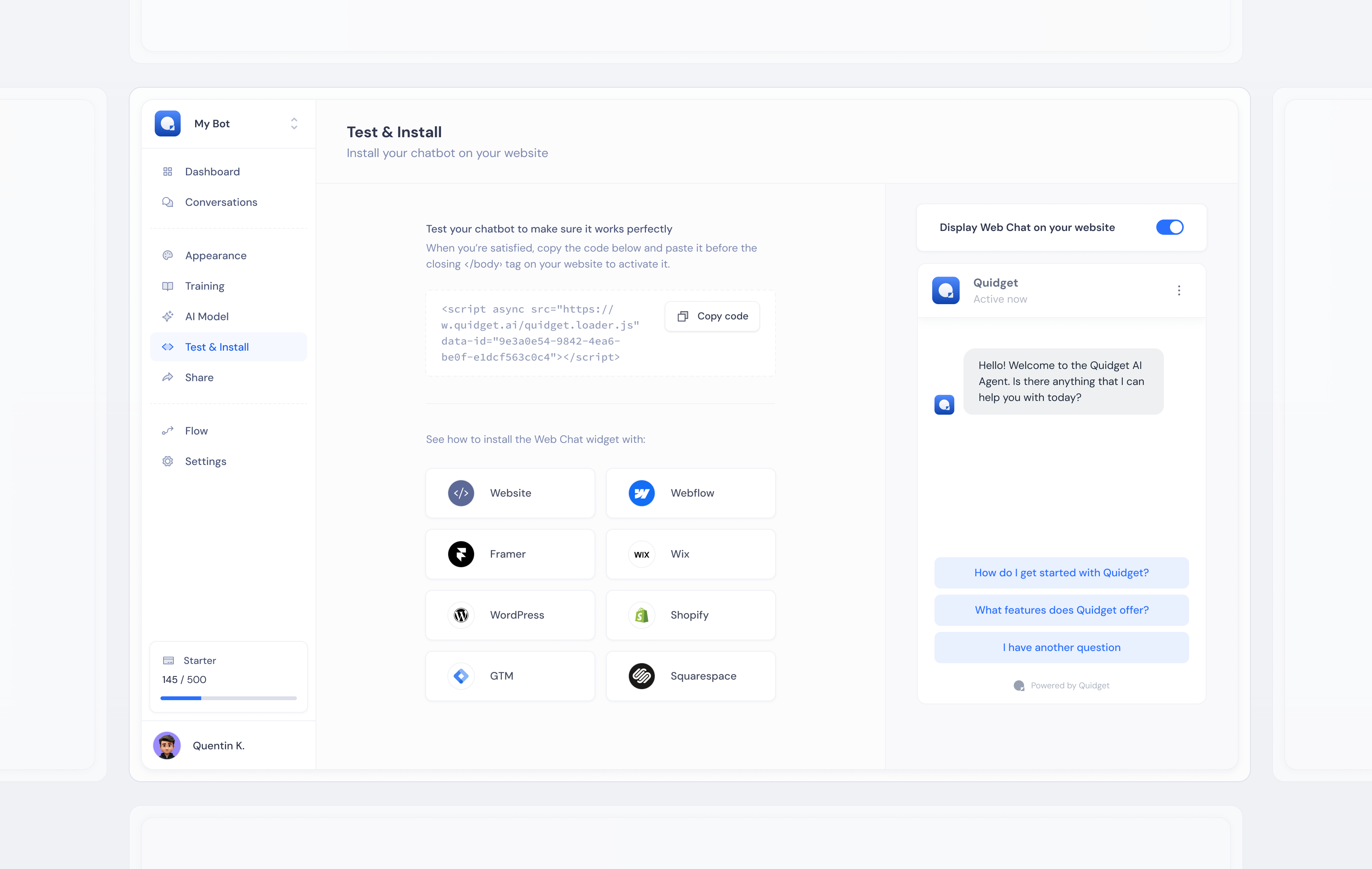
Test & Install — live preview of the configured widget alongside the deployment snippet, reducing the gap between "done" and "live".
The hardest problem in complex product design is progressive disclosure — deciding what's visible by default versus accessible on demand. Show too much and users feel overwhelmed. Hide too much and power users feel constrained. There's no universal answer, only a series of judgment calls informed by how different users approach the same task.
I solved this with consistent hierarchy: primary actions always immediately visible, secondary configuration accessible via tabs or expandable sections, advanced settings nested behind deliberate interaction. Users who wanted simplicity got simplicity. Users who needed control found it without hunting.
The other challenge was designing for context diversity. A law firm and a coffee shop both use the same product — completely different content, branding, conversation patterns, and goals. The interface needed to work well for both without feeling generic to either.
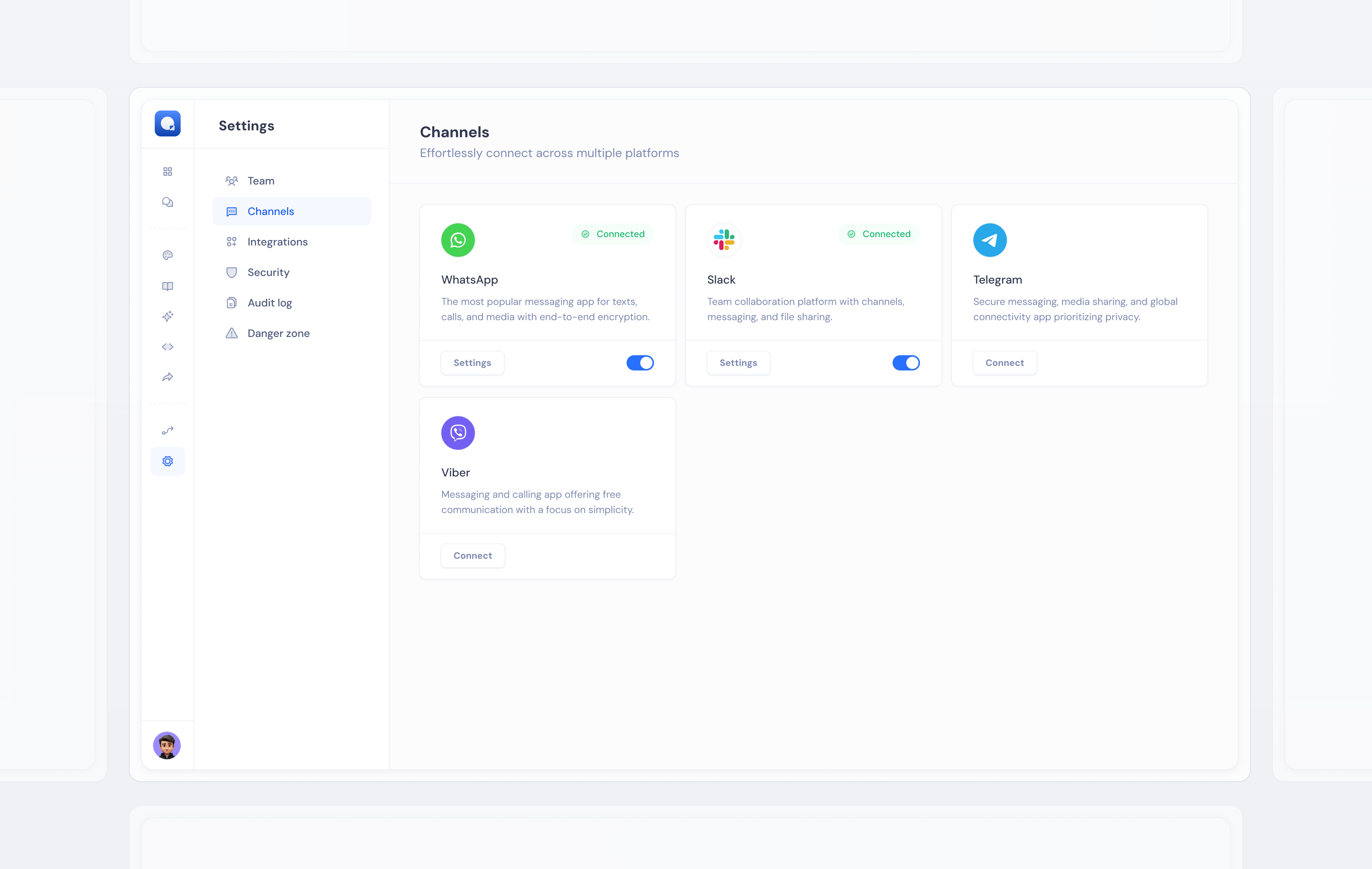
Channels — connecting the AI agent to web chat, email, WhatsApp, and other surfaces from a single management view.
A product UI that doesn't call attention to itself. The goal was always that users spend their mental energy on their business, not on figuring out the tool. When the design is working, users don't notice it — they just get things done.
The same component system fed directly into the marketing website and onboarding flow — one design language across every surface.
Work created for SupportYourApp, Inc. All rights reserved by SupportYourApp, Inc. Shared here for portfolio purposes.